As a FWFA project partner, the Bureau of Meteorology (BoM) launched a set of tools in their Climate Outlooks with more detail on extreme rainfall and temperatures for any location in Australia to help plan for extreme weather and climate events. The five extreme rainfall and temperature features provide farmers with information to improve resilience and productivity. Users can drill down to their specific location to view the chance of unseasonal and extreme temperature and rainfall for either the weeks, months, or seasons ahead. These tools were developed as part of the FWFA project, a partnership of the Australian Government and research and industry sectors, funded through the Australian Government's Rural R&D For-Profit Programme.
Extremes features from the FWFA project
Features 1 and 2 were released publicly on the Bureau's climate outlooks webpages in November 2021, including the extreme climate maps and location-based bar charts. The Features 1 and 2 video launch can be viewed here.
On 24 June 2022, features 3–5 were released:
Feature 3 — a location-based forecast rainfall and temperature time series: weekly and monthly forecasts as a time series for any grid point in Australia. Within the project these are called 'climagrams'.
Feature 4 — graphs displaying the probability of a comprehensive range of rainfall amounts for the coming weeks to seasons, termed 'probability of exceedance'.
Feature 5 — rainfall probability maps displaying the likelihood of exceeding 3-day rainfall totals, ranging from 15 mm to 75 mm in the weeks and fortnights ahead. These are described by the main customer as 'burst potential' maps.
A recording of the Bureau of Meteorology's Dr Andrew Watkins (Head of Long-Range Forecasts), Dr Avijeet Ramchurn (Senior Climatologist) and Dale Grey (Seasonal Risk Agronomist, Agriculture Victoria) exploring the FWFA forecast products on 14 July 2022, can be viewed here.
The FWFA extremes tools can be accessed on the Bureau's Climate Outlooks pages.
The Bureau of Meteorology Climate Outlooks
A summary of the Climate Outlooks is available here providing information about the maps and graphs along with videos and where you can navigate to find useful explanations of:
Information regarding the five FWFA extremes features is covered in 1 (3-day rainfall totals), 2 (Extremes Maps) and 4 (Location specific products: Decile bars, climagrams and Probability of Exceedance (PoE) graphs). The following information about the features is reproduced from those specific Bureau webpages.
Feature 1: Chance of extremes maps
Climate outlooks are able to be expressed as a percentage likelihood of extreme rainfall or temperature for those interested in possible weather extremes.
Chance of extremes maps show the likelihood of unusually wet or dry, or warm or cool conditions. They are displayed by the chance that the outlook will result in rainfall or temperature in the top or bottom 20% of historical observations for the selected outlook period. In addition to the percentage chance of this occurring, the legend also shows how this could be displayed as the number of times more likely. For example, a 40% chance of being in the lowest 20% of rainfall records is also two times the usual level of likelihood. A 60% chance would mean it is three times as likely.
Rainfall totals or temperatures which fall below the 20th percentile are considered unusually dry or unusually cool by the Bureau. This means the forecast extremes fall into the bottom 20% of observations. Typically, it would be expected that these would occur roughly once every five years under a normal climate. For example, the coolest June out of five years, or the driest spring in five years.
Rainfall totals or temperature which are above the 80th percentile are considered unusually wet or unusually warm. This means the forecast extremes fall into the top 20% of observations. Typically, it would be expected that these would occur roughly once every five years under a normal climate. For example, the warmest August out of five years, or the wettest spring in five years.
The climate model uses a 60km by 60km grid. For these outlooks the forecasts are calibrated to observations on a 5km by 5km grid.
Example map shows the chance of unusually high (in the top 20% of historical observations) rainfall for November 2021 – January.
Select any Australian location by using the search or tapping/clicking on the maps. This will pop up detailed information for that location for either rainfall, minimum or maximum temperature. Detailed information includes summary values and two outlook graphs for temperature, with three for rainfall. Stars indicate the historical outlook accuracy in that outlook period, for your selected location. Pop-up content uses the closest 5 km grid box for your location.
Feature 2: Decile bar graphs
The location-based bar graphs show the forecast probability of rainfall or temperature being in a particular climatological range for your selected location. This includes the likelihood of being in the bottom 20% (decile 1 and 2) of historical records, the top 20% (decile 9 and 10), or the three ranges in between: decile 3 and 4; decile 5 and 6; and decile 7 and 8.
The long-term average probability ("usual chance") for each category is 20%, shown by the horizontal dashed line. If the grey bar (the forecast) is above this line it means there is a stronger than usual chance that category will occur. If it is below the line there is less chance than normal.
In the example shown here for July to September rainfall for Canberra, the odds are stacked towards having a wetter season than usual in Canberra, with more than double the usual likelihood of having decile 9 or 10 rainfall (i.e., greater than 198.9 mm). There is a reduced chance of having a very dry season (less than 88.9 mm).
The rainfall bar graphs are less useful for areas that are climatologically very dry. In these areas, the median rainfall (and even the higher thresholds) are often close to zero and dividing them into 5 categories is not as meaningful.
The information above the bar graphs shows the observed median for the selected location for the 1981-2018 period. Underneath this are the percentage chance of experiencing unusually dry (cool) conditions, the chance of exceeding the median, and the chance of experiencing unusually wet (warm) conditions. In the case of rainfall for example, a higher chance of experiencing unusually wet conditions would also typically mean a high chance of exceeding the median rainfall. Similarly, a high chance of experiencing unusually dry conditions would typically mean a low chance of exceeding the median rainfall.
The stars on the right-hand side of the top panel refer to the accuracy of the outlook. If the model has performed well in forecasting for that location/period/time of year in the past, it will be indicated by three solid stars–meaning high past accuracy. If the model has low past accuracy for that outlook period, it will only have one solid star and two open stars. Refer to the past Accuracy on the Bureau's Outlooks pages for more information on accuracy.
Like the extremes maps, the pop-up boxes use a 5 km by 5 km grid. Pop-up boxes use the closest 5 km grid box.
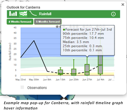
Feature 3: Observations and outlooks over time (Climagrams)
Timeline graphs include recent observations and outlooks for weeks or months. Click/tap respective buttons to change the timeline display between weeks and months. Hover/tap on the graph area to view rainfall or temperature details for particular dates.
The observations used in the graph (solid black line) are the same as that used in the Bureau's rainfall and temperature analysis. Refer to Rainfall map information for details on the rainfall analysis, and Temperature map information for details on the temperature analysis. For the weekly plots, the date listed at the bottom of the graph is the first day of the week; hover over/touch the line on the graph to see the full week information as well as the amount of rainfall over that week. For the example to the right, May 30th refers to the week of 30 May to 5 June. Canberra had approximately 34 mm of rainfall during this week.
The dashed black line shows the forecast period, specifically indicating the median of the forecast. The first week of the forecast may have been modified to respect the official weather forecast, while the subsequent three weeks of forecasts are fully from the climate forecast system ACCESS-S.
The forecast for each week is shown as a box and whisker plot. The green line in the centre of the box is the median of the forecast, with the outer edges of the box the 25th and 75th percentiles of the forecast. The outer edges of the lines are 10th and 90th percentiles. Hovering over a forecast point will give you the full range of forecast values. In the example to the right, the full range of values is shown for the forecast for Canberra for the week of 27 June to 3 July. The forecast median for the week is 3.5 mm, with the 25th percentile at 0.3 mm
(meaning a 75% chance of at least 0.3 mm), and the 75th percentile at 10.4 mm (meaning a 25% chance of at least 10.4 mm during this week).
For the monthly timeline graphs, the current month is a combination of observations and forecast data. This means as the end of the month is approached, the spread of likely outcomes for that first month becomes smaller, meaning the box and whiskers are smaller and closer together.
The stars above each respective forecast at the top of the graph area refer to its accuracy. If the model has performed well in forecasting for that location, period, and time of year in the past, it will be indicated by three solid stars–meaning high past accuracy. If the model has low past accuracy for that outlook period, it will only have one solid star and two open stars. Refer to the past Accuracy section for more information on accuracy.
The coloured background of the graph helps put the outlooks into historical perspective. It is the observed range of values split into five bins; the white area is the middle 20% of past observed rainfall totals, while the blue/green in the rainfall are the top 40%, and the yellow/brown is the bottom 40%. For temperatures, the reds are the top 40%, and the blues are the bottom 40%. These values are calculated over 1981–2018.
Both observations and outlook information use the closest 5 km grid box to your location.
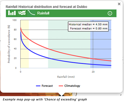
Feature 4: Rainfall line graphs showing the chance of exceeding a range of totals (Probability of Exceedance (PoE))
Line graphs show the percentage chance of exceeding a range of rainfall totals.
These graphs are also known as Probability of Exceedance (PoE) curves.
There are two lines shown on the graph. The red line shows the historical chance at that location of receiving a particular rainfall total. Low rainfall totals have a high chance of occurring, while higher rainfall totals will have a much lower chance. For example, the adjacent graph shows an outlook for the week of 25 June to 1 July at Dubbo. Dubbo typically has a 60% chance of receiving around 2 mm of rainfall during this week, a 40% chance of 8 mm, and a 20% chance of 20 mm. The The blue line is the forecast probabilities. When the blue line is below the climatological red line, this indicates a drier outlook, while a blue line above it indicates a wetter outlook. The example shows a drier outlook, with only a 40% chance of receiving 2 mm, and a 20% chance of 8 mm, with just under a 10% chance of 20 mm.
Tapping/hovering the mouse over the graph brings up the percentage chance for the corresponding rainfall depth in a tooltip. These outlooks allow users to obtain information for specific rainfall amounts that are of interest for their specific application.
Like the timeline graphs, the coloured background of the graph also helps put the outlooks into historical perspective. It is the observed range of values split into five bins; the white area is the middle 20% of past observed rainfall totals, while the blue/green in the rainfall are the top 40%, and the yellow/brown is the bottom 40%. These values are calculated over 1981–2018.
Feature 5: Chance of 3-day rainfall total maps
Chance of 3-day totals maps show the percentage chance of receiving at least the selected total over three consecutive days within the forecast period. These are often called rainfall bursts. Outlook periods include weeks and fortnights.
Four specific thresholds are available: 15 mm, 25 mm, 50 mm or 75 mm. These four available quantities align well with agricultural and livestock requirements. The three higher thresholds approximately represent 1 to 3 inches.
The 15 mm and 25 mm thresholds are typically better suited for southern regions from late autumn to early spring, while the 50 mm and 75 mm thresholds are more suited to the northern tropics from late spring to early autumn (i.e., the northern Australian wet season).
The example map shows the chance of receiving a total rainfall accumulation of at least 15 mm spread over three consecutive days during the week of 25 June to 1 July 2022. The colours on the map show the percentage chance of at least 15 mm of rain occurring. The location highlighted with the black circle in south-west Victoria has a 40% to 60% chance of receiving 15 mm of rain across three days within the period.
The climate model uses a 60 km by 60 km grid. For these outlooks the forecasts are calibrated to observations on a 5 km by 5 km grid.
Example map shows the chance of receiving a total rainfall accumulation of at least 15 mm spread over three consecutive days during the week of 25 June to 1 July 2022.
Watch Dr Peter Hayman (Principal Scientist in Climate Applications at the South Australian Research and Development Institute (SARDI)) provide "An agricultural scientist's view on FWFA products to help manage a La Niña summer" below
Acknowledgements
This project was supported by funding from the Australian Government Department of Agriculture, Fisheries and Forestry as part of its Rural R&D for Profit program in partnership with rural Research and Development Corporations, commercial companies, state departments and universities. Meat & Livestock Australia (MLA) was responsible for the overall management of the project.